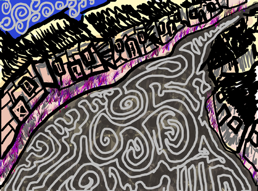
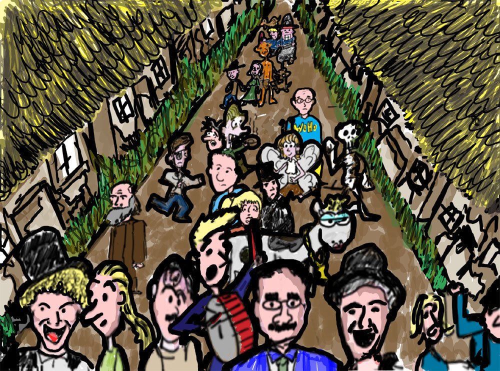
Here are two unused backgrounds for a project. I like them both, but they are failures. I’m more partial to first one, but it is too psychedelic. The second one is too busy. However, the second features one divine bovine. The bovine is very similar to another drawing of a cow I did in High School for a commercial contest. My idea had to do with milk, but the actual commercial contest topic had nothing to do with milk. Everyone told me not to draw the cow – but I inisted. Needless to say, I lost.
hey, there… now, just because you aren’t going to use them, it doesn’t mean that those drawings are failures. the drawings themselves are quite good! don’t be so negative!
I like *Crowded Street* alot myself. Although I would offer the critique that the people are nicely distributed about the street and provide a nice perspective, except the ones right in front who look a bit smushed up against the bottom edge of the picture.
On the other hand I do like the squiggle of *Crazy Street*, except that the consistent width of it’s line doesn’t mesh exactly in the context of the picture with the perspective of the street. But part of the thing I like about it is it’s almost like some sort of enormous chalk drawing that some obsessive graffitti artist filled up the entire blvd. with. Although alot different it reminds me somehow of the chalk drawings from *Low Men in Yellow Coats* (Hearts In Atlantis).
I like the vitality of Crazy Street and the bearlike expressions of the houses, but I really like the autobiographical history of Crowded Street. Do I recognize a whole lot more other than the Divine Bovine?
Thanks for the kind and constructive comments.
I’ve completed about 60% of the backgrounds I’m going to use. The ones I’m using are a little more realistic in coloration like *Crowded Street* (though they are still ever so slightly garish) but they don’t have any people in them like *Crazy Street* (there were a couple reasons for not having people).